The home helps the customer choose a place.
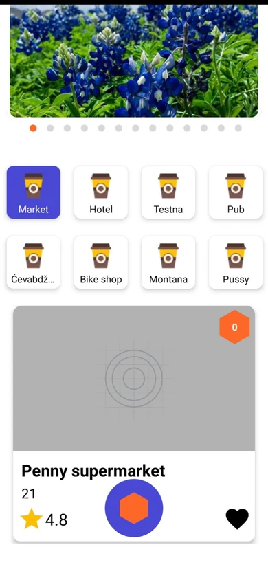
The first version had categories and cards with placeholder images. The new home adds store search, sorting and favorites, and each card shows the photo, rating and category of the place.

Thanks! If you booked a call, the invite is already in your email.

Boba is a mobile app from Sarajevo, Bosnia and Herzegovina, that helps businesses run their own loyalty programs. Customers earn and redeem points, called bobas, at the places they visit. Owners set the rewards, and employees confirm each purchase by scanning the customer’s QR code.
The Boba team wanted to redesign its cross-platform app before development. One product had to serve three people with different goals. The customer collects rewards, the owner manages offers, and the employee confirms purchases at the counter. I was hired to design the main screens and patterns and to help with the user flow.
The project started with a kickoff call with the client and the developer. Before the core screens, I shared a page of references and a style guide in Figma. The team chose what fit the product, such as a bottom bar with an emphasized QR button, a clear QR screen, browsing by category, a home page for owners, and charts for statistics. Those choices shaped the navigation and the visual system.
Drag the bar across each frame to compare the first version, on the left, with the redesign, on the right.
The first version had categories and cards with placeholder images. The new home adds store search, sorting and favorites, and each card shows the photo, rating and category of the place.
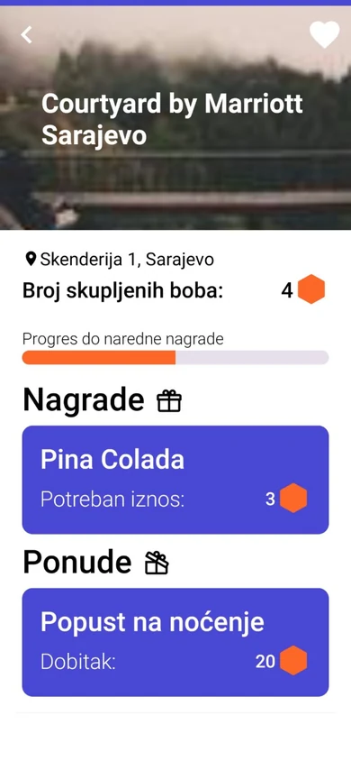
The first version listed rewards and offers as plain blocks. The new page splits the place into items, overview and leaderboard, and each item shows its photo, price and the bobas it earns or costs.

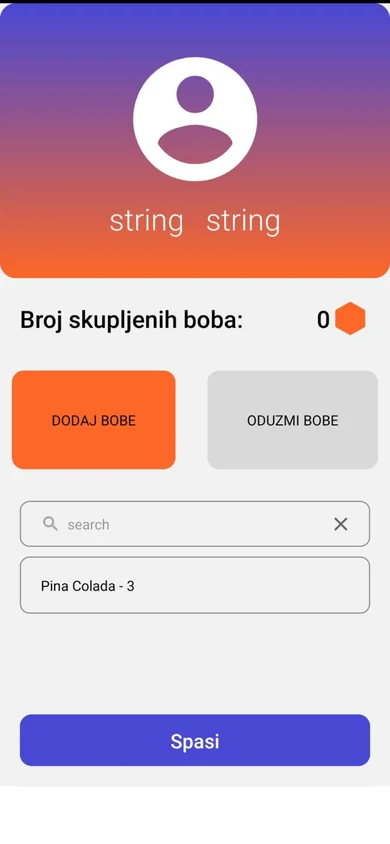
In the first version the employee looked up rewards in a search field. In the new screen the employee scans the customer once and adds every item of the visit, with the quantity of each, to the same transaction.

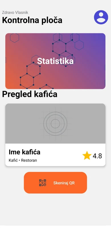
The first version opened on a single statistics banner. The new home shows customers, loyalty and bobas issued and redeemed for the chosen place and period, with the next billing and a sales chart.

This screen did not exist. After the scan, the customer gets a receipt with the place, each item and the bobas earned, as the client asked during the project.

The client and the developer reviewed the screens in Figma comments, on details that matter in code. Those covered the size of buttons, long descriptions, the store name on each item, and icons that match the library the app uses.
I delivered every screen and the animated logo splash. The client rated the project 5.0 on Upwork.
You’ve done a great job understanding and integrating your ideas with the design and even features we overlooked.


