Redline MD, a landing page built for Google Ads
The goal is to turn ad clicks into contract uploads. 35% of the traffic is mobile, and mobile brings less than 10% of the revenue.
 Before
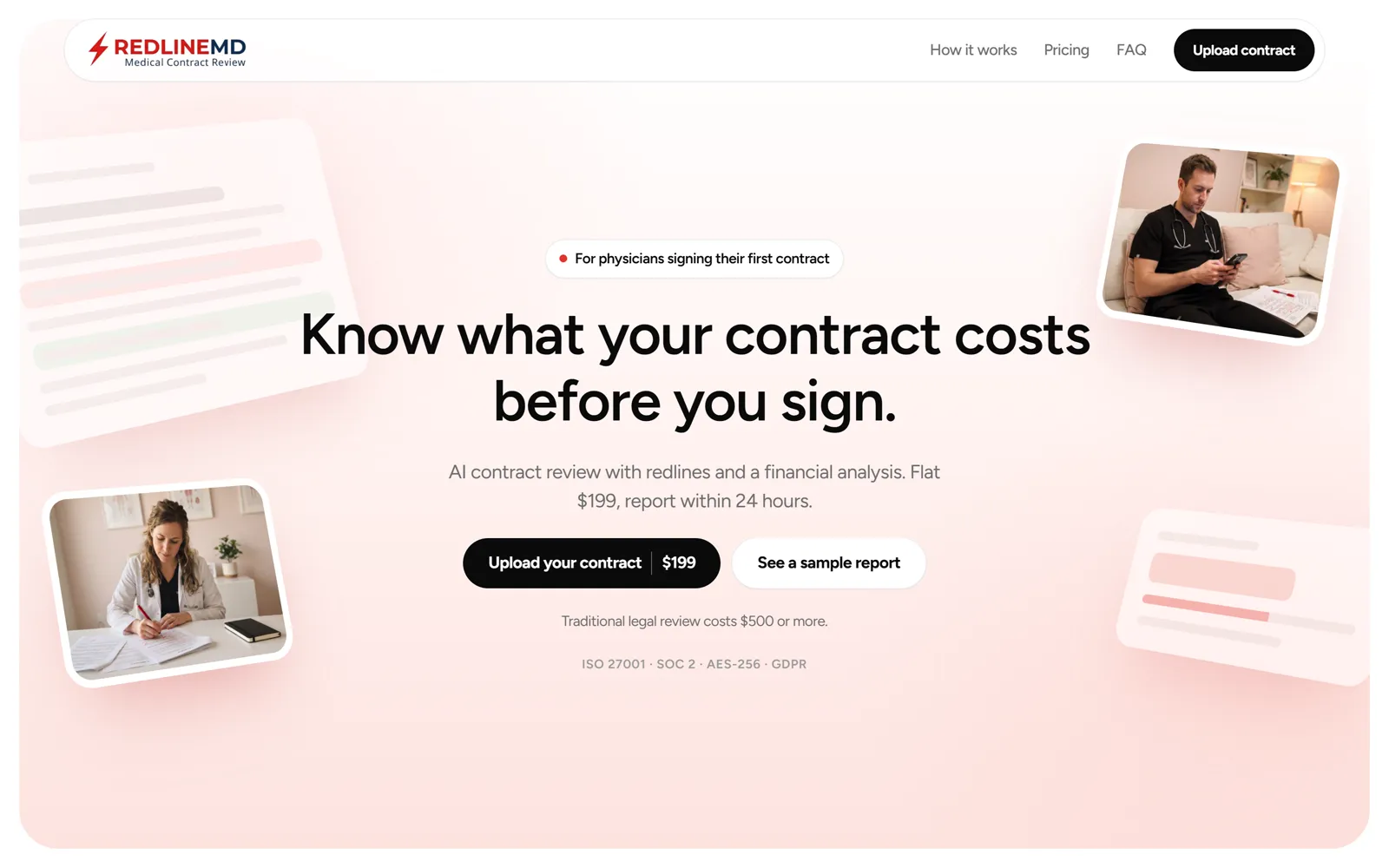 After
AfterA site that made physicians doubt it

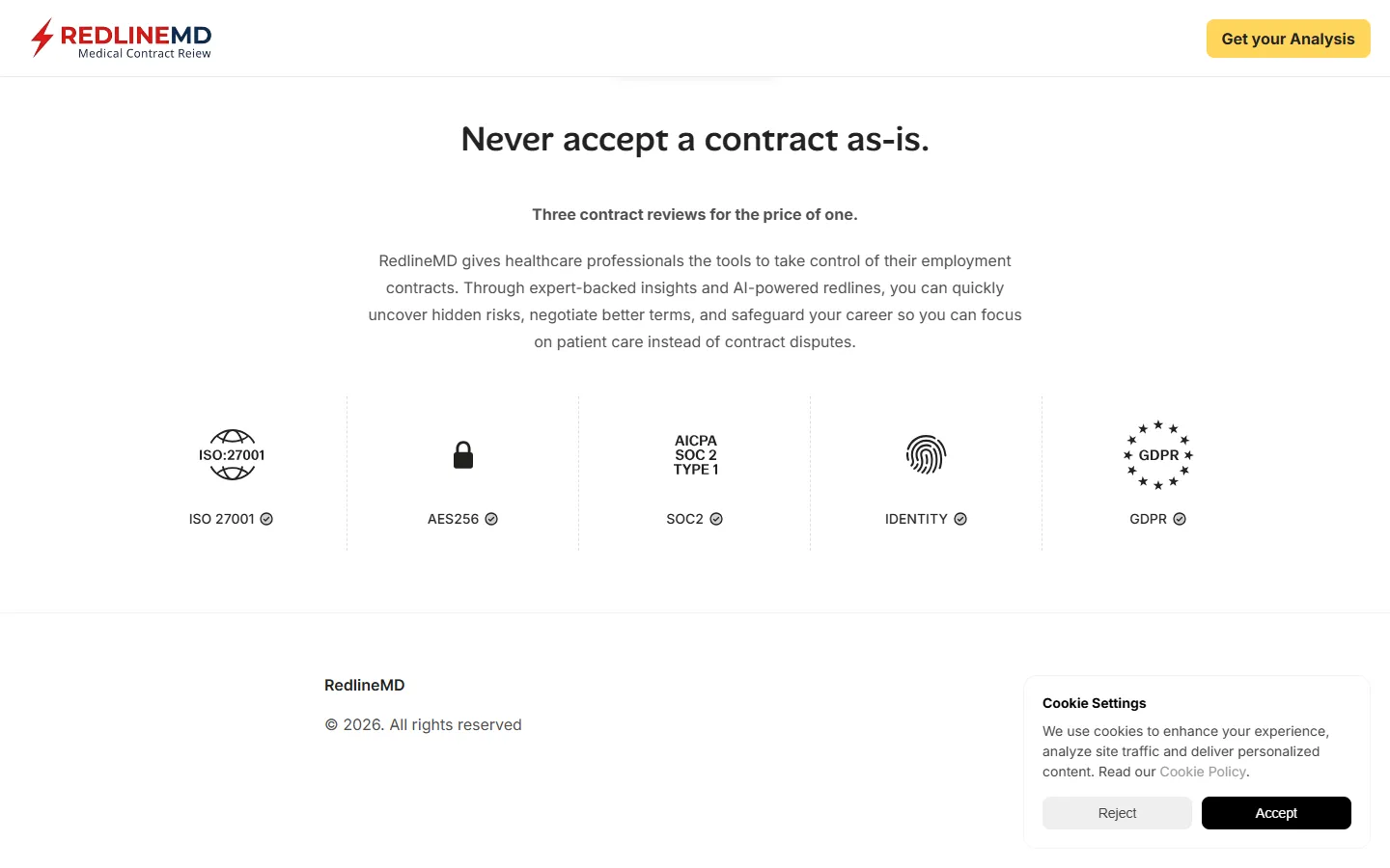 Before
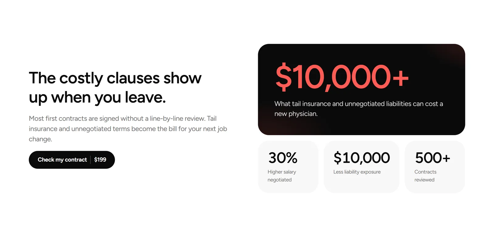
The ROI before the scroll
Numbers that agree with each other
The sample report, on the page and protected
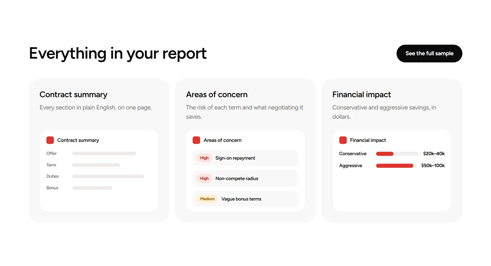
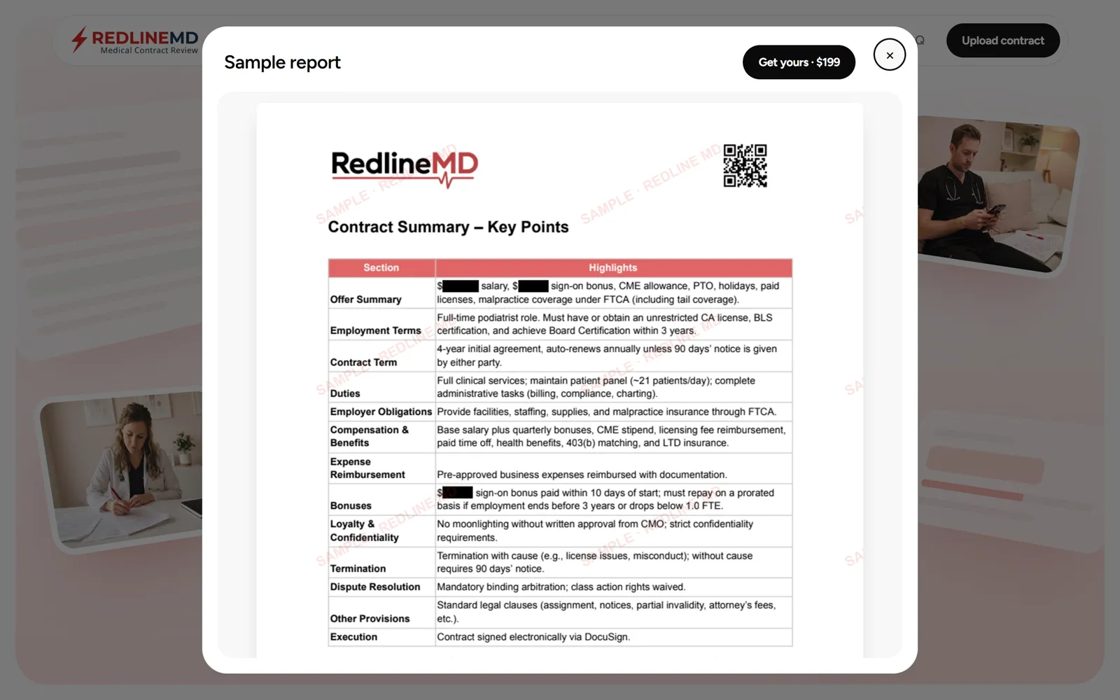
Try it before you pay
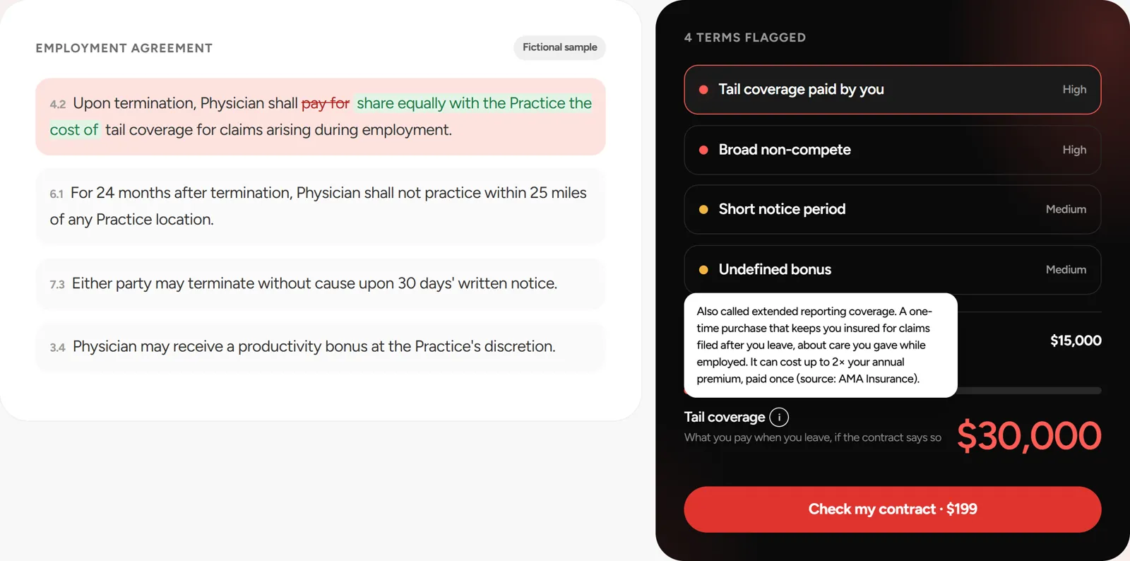
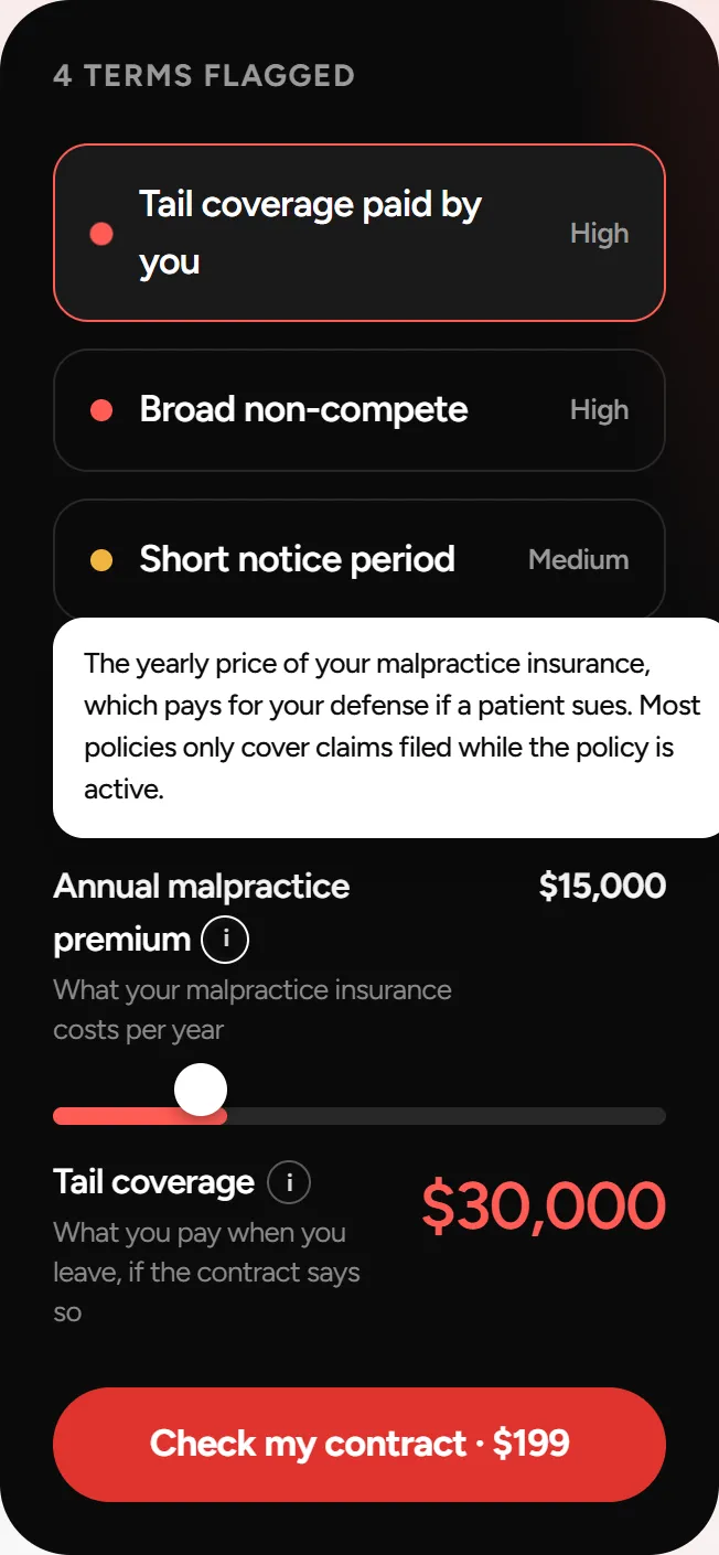
A calculator anyone understands
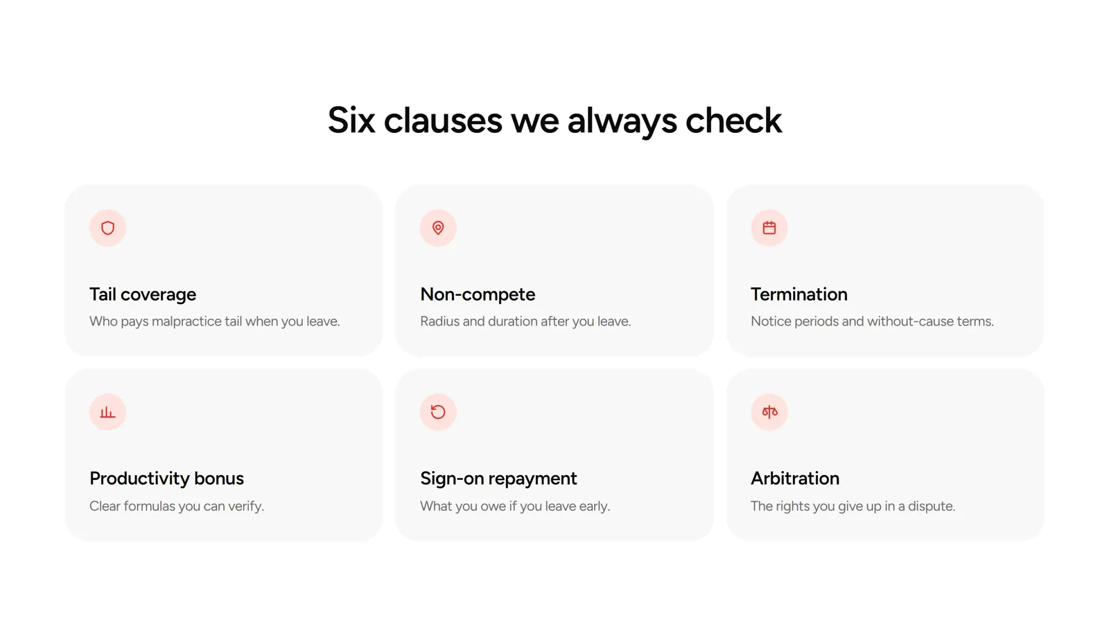
Six clauses, each with a source
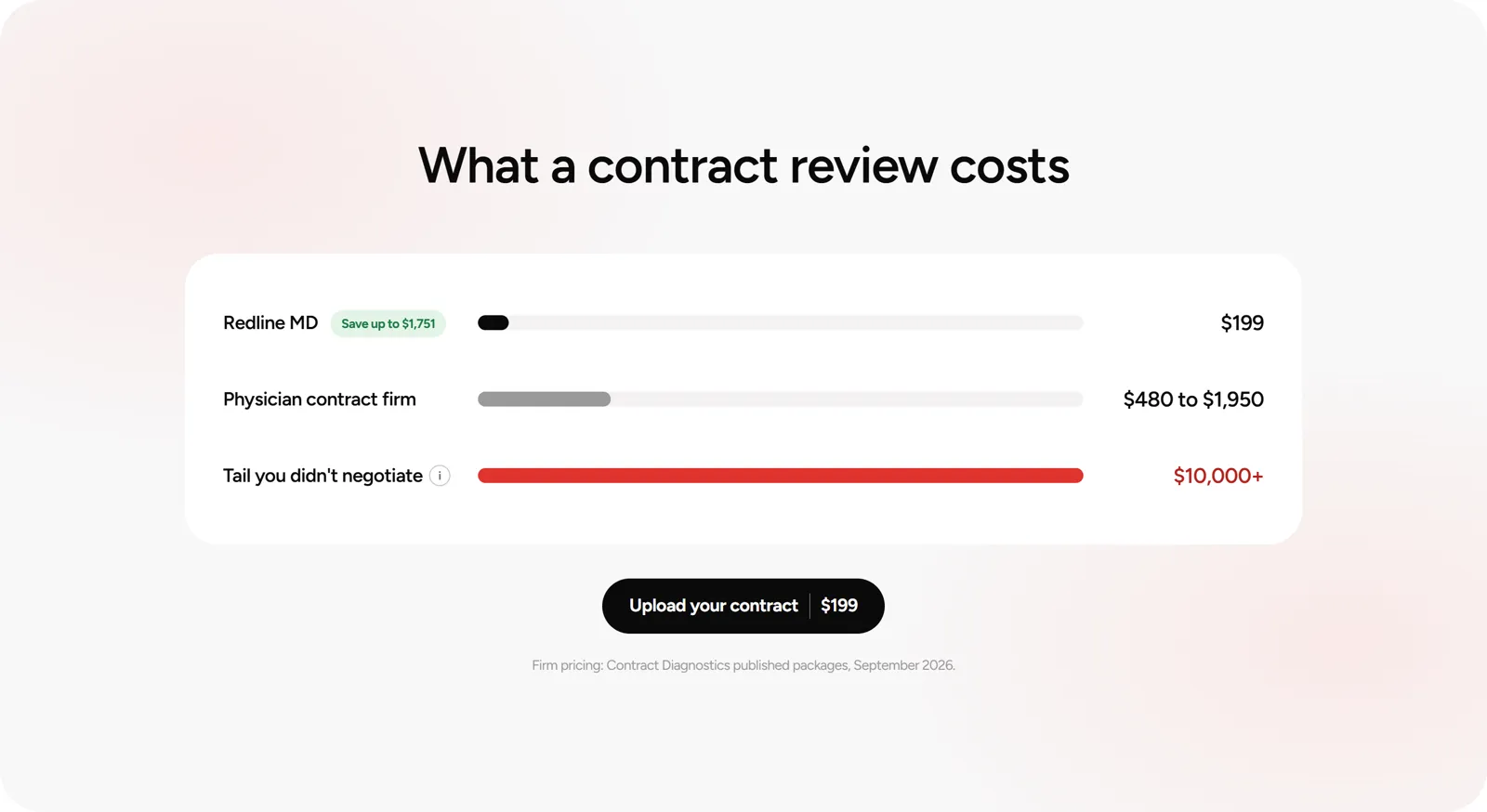
The cost, side by side
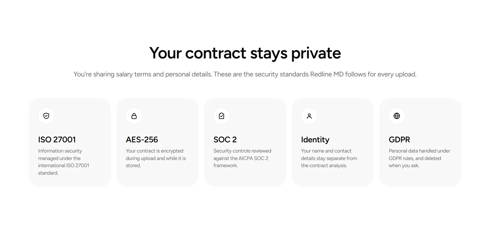
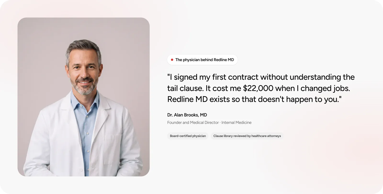
Trust before the payment
Built for the phone first
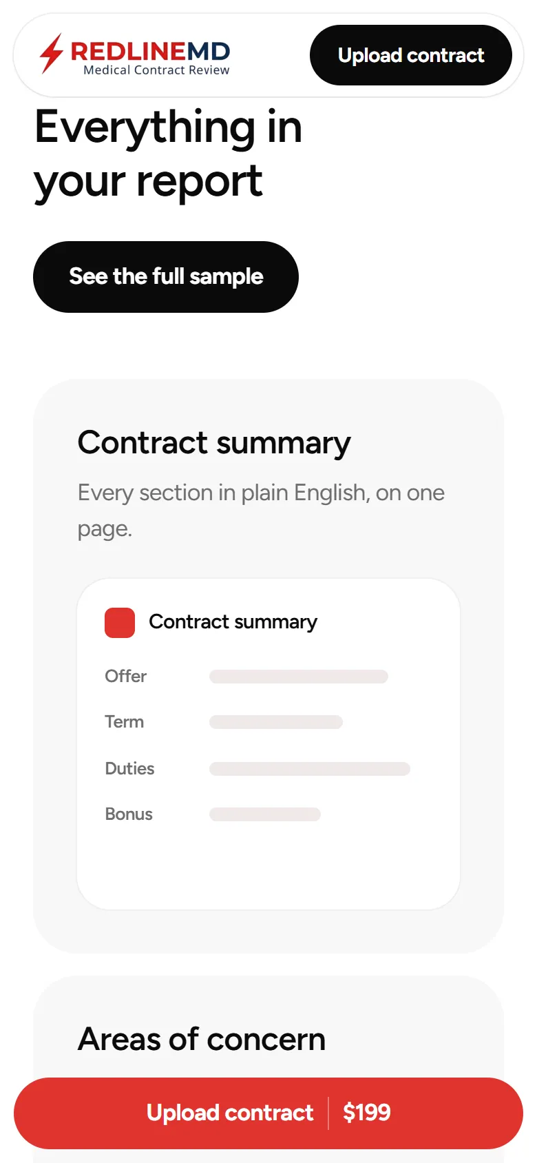
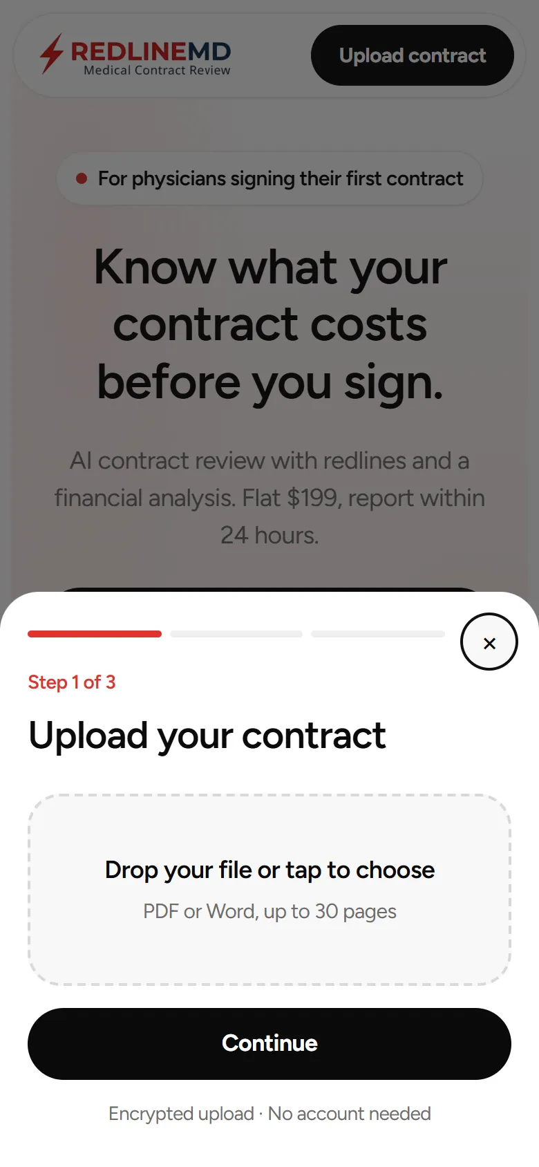
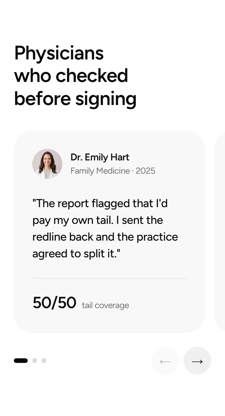
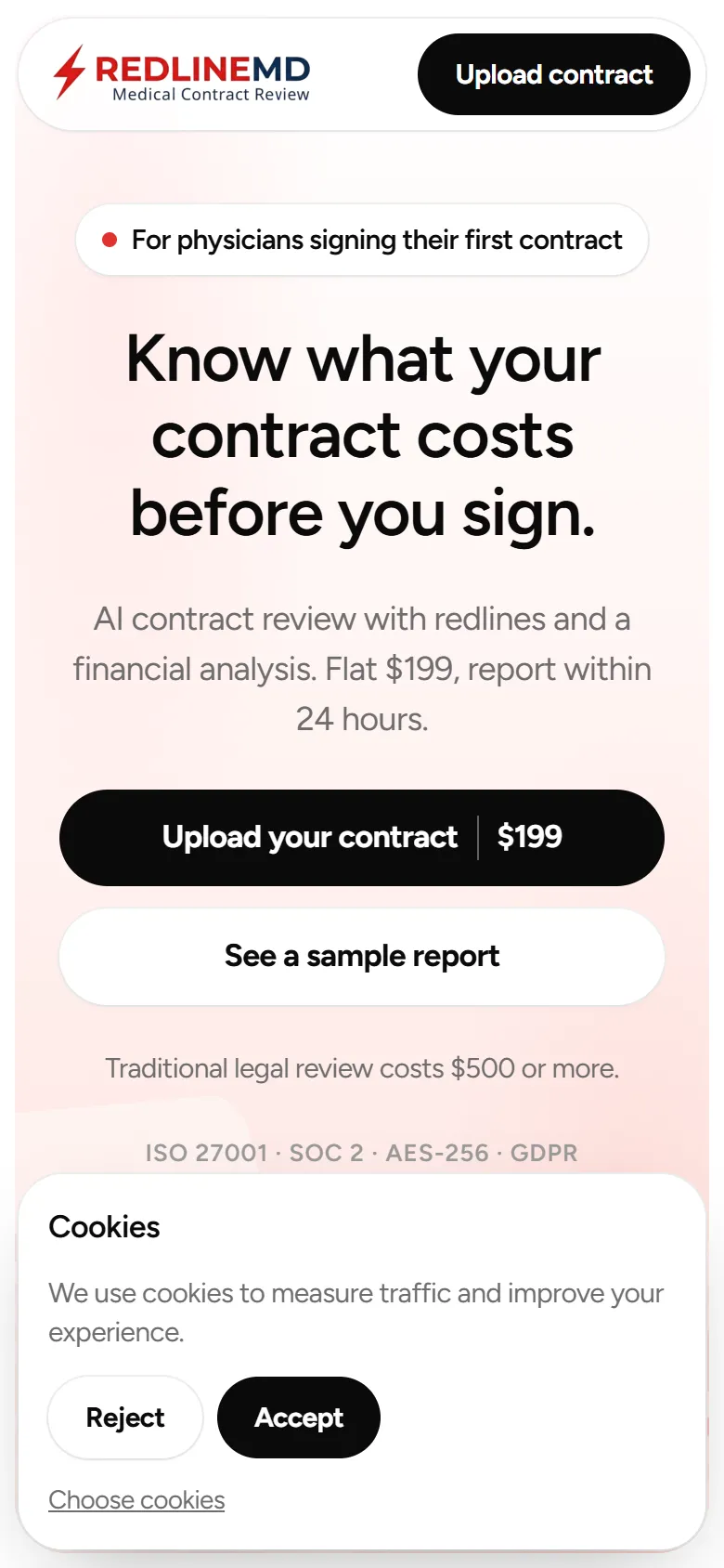
Everything stays on the page
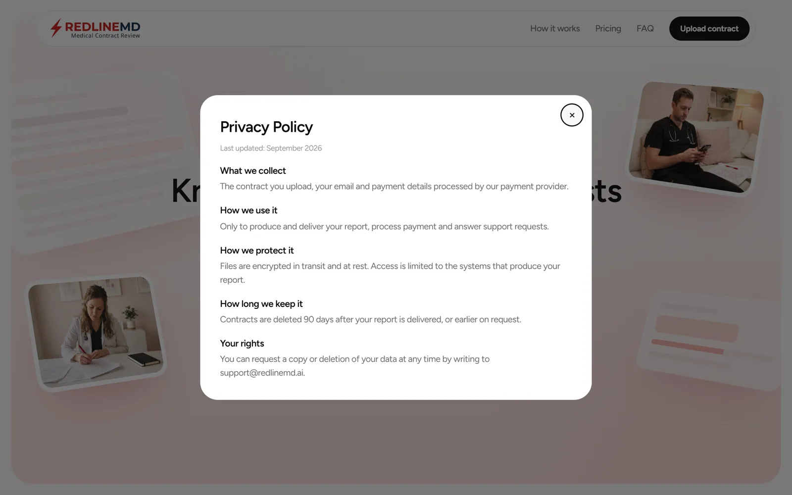
Easy for the team to edit
Webflow and Client-First
Every class follows the Client-First naming, from the page structure to the components.
Finsweet
Attributes for the accordion, modals, counter and slider, and Cookie Consent for the banner, all editable without code.
Motion
Entrances, hero art, bars and the founder photo are Webflow Interactions, editable in the Designer with no custom code.
Checked against WCAG AA
Contrast on every text
Every text on both pages, on its real background, at all 4 breakpoints, including modals, the cookie card and the fixed CTA. All at 4.5:1 or more, even large text.
A darker red for text
Brand red on the gray cards reached only 4.25:1. Text now uses a darker red at 6.1:1, and buttons keep the brand red.
Fields you can see
Input borders went from 1.4:1 to 5.5:1, and text stays at 16px so iPhones don't zoom in on focus.
Errors in words
Upload errors are written next to the field and read by screen readers, not shown by a red border alone.
Works with a keyboard
The demo flags, the carousel arrows and the tooltips all respond to Tab and Enter.
Motion you can turn off
With reduced motion on, entrance, scroll and hover animations stop, and every element shows at rest.
Before launch
Testimonials, founder, photos, policy answers and legal texts are placeholders for Redline's real content. The security badge descriptions explain each standard and need Redline's confirmation.
See the landing page live
Designed and implemented in Webflow by João Marcos Oliveira.
Redline MD design system
Every color, type style, class and component on the landing page, named with Client-First, so the team can copy any piece from here.
Colors
Black and white carry the page, red marks risk and the brand, blush warms the surfaces, and green only means savings.
Black
#0a0a0a · background-color-black
Text, primary buttons, dark cards, footer
White
#ffffff · background-color-white
Page, cards on gray, secondary buttons
Gray 50
#f8f7f7 · background-color-gray-50
Section cards, feature and testimonial cards
Gray 200
#eeeeee · background-color-gray-200
Borders, rings, gray pills, carousel arrows
Gray 300
#d9d9d9 · background-color-gray-300
Dots, dashed dropzone, text on black
Gray 500
#9a9999 · background-color-gray-500
Firm bar, labels on dark, sources
Gray 600
#696868 · background-color-gray-600
Body text color
Gray 900
#272727 · background-color-gray-900
Borders and tracks on dark cards
Red
#de332f · background-color-red
Brand, accent button, risk bar, button hover
Red light
#ff5b54 · background-color-red-light
Red on black: big numbers, slider, active flag
Red dark
#b42320 · background-color-red-dark
Red text on light: strikes, risk values
Blush
#fde3df · background-color-blush
Active clause, icon circles, red pills
Blush light
#fff4f2 · background-color-blush-light
Gradient stop in the hero and CTA
Green
#1c7a43 · background-color-green
Savings and suggested redlines
Green light
#e3f4e8 · background-color-green-light
Savings badge, inserted text
Amber
#f2b441 · background-color-amber
Medium risk dot
Amber light
#fdf0d5 · background-color-amber-light
Medium risk pill
Logo
Redline's own logo, with the tagline typo fixed ("Reiew" to "Review") using the letters of the original file. The light version swaps the navy for white on dark backgrounds.

logo.webp · brand_logo · 2.5 / 2.125rem tall

logo-light.webp · footer
Gradients
Hero
section-card is-hero · #ffffff → #fff4f2 → #fde3df
CTA
section-card is-cta · #fff4f2 → #fde3df
Typography
Figtree from Google Fonts in 4 weights, with tight tracking on every heading. Sizes shown as desktop / tablet / mobile.
Aa
Figtree
Regular 400 · Medium 500 · Semibold 600 · Bold 700
body: 1.125rem / 1.5, letter-spacing -0.02em, color #0a0a0a
Tag styles
The tag sets the SEO level and the class sets the look, so an h2 can look like an H3 when the layout asks for it. Every heading on these pages has a heading-style class, and the tag styles below are the base for any heading added without one.
Body
Figtree · 1.125rem / 1.5 · #0a0a0a · letter-spacing -0.02em
Paragraph
margin 0 · size and color from the body
H1
3.75 / 3 / 2.5 / 2.25rem · 600 · 1.15 · margin 0
H2
3 / 2.5 / 2.125rem · 600 · 1.15 · balance · margin 0
H3
2.5 / 2 / 1.75rem · 600 · 1.15 · balance · margin 0
H4
1.5rem · 600 · 1.2 · margin 0
H5
1.25rem · 600 · 1.3 · margin 0
H6
1.125rem · 600 · 1.4 · margin 0
Heading and text classes
Know what it costs
The costly clauses
Try it before you pay
Contract summary
"It cost me $22,000 when I changed jobs."
"The practice agreed to split it."
AI contract review with redlines and a financial analysis.
Every section in plain English, on one page.
PDF or Word, up to 30 pages
4 terms flagged
Dr. Emily Hart
Family Medicine · 2025
Firm pricing: Contract Diagnostics published packages.
Text utilities
Client-First utility classes to adjust one property without a new class.
Weight
text-weight-normal · 400
text-weight-medium · 500
text-weight-semibold · 600
text-weight-bold · 700
Color
text-color-black
text-color-secondary
text-color-brand
text-color-red
text-color-green
Align
text-align-left
text-align-center
text-align-right
Style
text-style-allcaps
text-style-eyebrow
text-style-balance keeps titles free of orphans
text-style-nowrap keeps words together
text-color-white on black
Surfaces and cards
Sections sit inside a rounded frame (section-frame > section-card, radius 40). Cards inside use radius 32, smaller parts 24, 20 and 16.
section-card
section-card is-hero
section-card is-cta
problem_card · demo_review · footer_component
section-card is-texture
how_card · pricing_component · card_component
Cards in use
Tail coverage
Who pays malpractice tail when you leave.

"The practice agreed to split it."
Upload
Add your contract, up to 30 pages.
2.5rem · section-card
2rem · cards
1.5rem · shots, art
1rem · flags, clauses
pill · buttons, pills
Layout
Client-First structure on every section. Horizontal padding lives only in padding-global, and containers only set the max width.
page-wrapper · overflow clip
main-wrapper
section_[name] › section-frame (1.25 / 0.5rem) › section-card (radius 2.5rem)
padding-global padding-section-large · one div: 1.5rem sides, 8 / 6 / 4.5rem top and bottom
container-large · 79.5rem · container-small · 51.25rem
content · padding-section-medium 6 / 3.5rem · padding-section-small 3.5 / 3 / 2.5rem
Max width
max-width-small · 34rem
max-width-medium · 44rem
max-width-large · 54rem
max-width-full · none
Heading blocks
heading_component · gap 1.25rem, margin-bottom 3.5rem
heading_component is-center · left on tablet and mobile
heading_component is-flush · no margin
Grids
report_component · terms_component · how_component · testimonials_component
problem_component · demo_component · founder_component
1 column on tablet, carousel for testimonials
Spacing and utilities
Spacers add vertical space between blocks without margins, and the hide classes remove an element per breakpoint.
spacer-tiny · 0.125rem
spacer-xxsmall · 0.25rem
spacer-xsmall · 0.5rem
spacer-small · 1rem
spacer-medium · 2rem
spacer-large · 3rem
spacer-xlarge · 4rem
spacer-xxlarge · 5rem
spacer-huge · 6rem
spacer-xhuge · 8rem
Hide
hide · always
hide-tablet · 991 and below
hide-mobile-landscape · 767 and below
hide-mobile-portrait · 479 and below
Overflow
overflow-hidden
overflow-visible
page-wrapper uses overflow clip, so sticky still works
Shadows
cards · 0 0 0 1px #eeeeee
floating · 0 40px 80px -30px red 35%
shots · 0 30px 60px -30px black 28%
Components
The pieces that make the page work, shown in their real states.
Clause redline · demo_clause is-active · demo_strike · demo_insert
6.1For 24 months 12 months after termination, Physician shall not practice within 25 miles 10 miles of any Practice location.
Flags · demo_flag · demo_flag is-active · demo_flag-dot is-mid
Calculator row · demo_calc-row · demo_calc-term · demo_calc-sub · tooltip_component
Cost bars · pricing_row · pricing_bar is-us / is-firm / is-risk
Carousel nav · carousel_dot is-active · carousel_arrow
Upload step · modal_progress · modal_dropzone · modal_foot
Step 1 of 3
Cookie card · cookie_banner · cookie_actions
Webflow components
Global Styles · every page · code embed
The states that JavaScript and Finsweet switch on, and the button hover. The only CSS outside the classes.
Project Bar · every page · project-bar_component
Links the landing page, the case study and this style guide.
Navbar · landing page · navbar_component
Logo, section links and the upload button, fixed at the top.
Footer · landing page · footer_component
Logo, product and legal links, contact and the disclaimer.
Overlays · landing page · overlays_component
Upload flow, sample report, legal modals, cookie banner and the sticky CTA on mobile.
Motion
Every animation is a Webflow Interaction, so timing and easing are edited in the Interactions panel. No animation lives in custom code.
Fade up on scroll
Scroll into view · trigger element
Each block rises 28px and fades in over 0.9s. Cards in a row start 80ms apart.
Hero art enter
Scroll into view · outQuart 1.5s
The photos and contract cards slide in from the sides as the page loads, one after the other.
Bar grow on scroll
Scale X 0 → 1 · origin left
Cost bars and report bars grow from the left in sequence.
Image reveal on scroll
Opacity + scale 1.06 → 1
The founder photo fades in from a slight zoom.
Button hover
button_hover · class transition
A red layer slides up behind the label on hover.
FAQ icon
Finsweet accordion · is-accordion-active
The plus rotates 45° into a close icon, and the answer opens with a 400ms max-height transition.
Finsweet
Interactions set with attributes in the Designer, so the team edits them without code. Scripts load once in the site head.
Accordion
FAQ, one item open at a time
fs-accordion-element="group" · fs-accordion-single="true"
accordion · trigger · content · arrow
Modal
Upload, sample report, terms, privacy and cookie policy
fs-modal-element="modal · open · close"
fs-modal-instance="upload · report · terms · privacy · cookies"
Number count
The $10,000 card and the 3 stats
fs-numbercount-element="number"
fs-numbercount-end · locale="en-US" · duration
Range slider
The malpractice premium in the calculator
fs-rangeslider-element="wrapper · track · fill · handle · display-value"
min 5000 · max 40000 · step 1000 · start 15000
Cookie Consent
Opt-in banner and preferences
fs-cc="banner · allow · deny · open-preferences · preferences · submit"
fs-cc-checkbox="analytics · marketing"
Custom code and links
Only what classes can't express lives in custom code, and every modal has its own link.
Site head
Figtree and the Finsweet scripts
Rules classes can't hold: tag styles, state selectors, embed SVG sizes, print
Landing body
Upload steps, demo redlines, calculator, carousel
Sticky CTA, modal links, report protection
Case study body
Tabs between case study and style guide, each with its own link
/#terms-of-service
Opens the Terms of Service
/#privacy-policy
Opens the Privacy Policy
/#cookie-policy
Opens the Cookie Policy
/#cookie-settings
Opens the cookie preferences
/#sample-report
Opens the protected sample report
/case-study#style-guide
Opens this style guide
Breakpoints
Webflow's default breakpoints, designed mobile-first for the 35% of traffic on phones.
Desktop
992 and up
Two-column blocks, centered section titles, hero art on both sides.
Tablet
991
One column, titles aligned left, testimonials as a carousel, founder in two columns.
Mobile landscape
767
Sticky CTA, full-width buttons, hero photos at the bottom, smaller type.
Mobile portrait
479
H1 at 2.25rem and tighter cards.